Introduction
In the fast-paced world of the internet, speed is everything. A few seconds of delay in website loading time can mean the difference between keeping a visitor engaged and losing them to a competitor. One of the most common culprits behind sluggish websites is oversized image files. While images play a critical role in engaging users, enhancing content, and conveying messages visually, they can also significantly slow down a site if not properly optimized.
Images account for the majority of the total download size on most web pages. This makes them a prime target for optimization. However, the challenge lies in finding the balance between reducing file size and maintaining image quality. Compressing images too much can result in visual degradation, while high-resolution images can bog down loading speeds, especially for mobile users or those with limited bandwidth. This delicate balancing act is where smart image optimization techniques come into play.
Optimizing image file sizes without sacrificing quality is not just a technical task—it’s a vital component of good web design and user experience. According to research by Google and other performance analytics companies, faster websites enjoy higher user satisfaction, longer engagement, and better conversion rates. Page speed is also a confirmed ranking factor in search engine algorithms, meaning optimized images contribute directly to your site’s SEO performance.
Modern web users expect pages to load almost instantly. A study by Akamai found that 53% of mobile users will abandon a site if it takes longer than three seconds to load. In that context, large, unoptimized images can be a silent killer of web performance. For businesses, bloggers, e-commerce platforms, and content creators, optimizing images is not optional—it’s essential.
Fortunately, advancements in image compression technology, file formats, and responsive design practices now make it possible to achieve significant reductions in image file size without noticeable quality loss. Whether you’re a web developer, graphic designer, content manager, or just someone managing a personal blog, understanding how to properly optimize images can save bandwidth, improve loading times, and enhance the overall user experience.
So, what does it mean to “optimize” an image for the web? In essence, it involves reducing the image’s file size through various means—compression, resizing, format selection—while preserving as much visual fidelity as possible. There are two types of image compression: lossless and lossy. Lossless compression reduces file size without any loss of image data or quality, whereas lossy compression permanently removes some image data to achieve smaller sizes. Each has its uses depending on the type of image and the acceptable quality threshold.
Choosing the right image format is also a crucial part of the optimization process. JPEGs are excellent for photographs due to their ability to compress complex images effectively. PNGs are better suited for images with transparency or sharp edges, like logos or icons. Meanwhile, newer formats like WebP and AVIF offer even greater compression efficiencies, with support steadily increasing across modern browsers. By selecting the appropriate format, you can reduce file sizes dramatically while maintaining—or even improving—image clarity.
Another important factor is image dimensions. Far too often, websites display images that are much larger than necessary, scaled down by HTML or CSS rather than being resized before upload. Serving images at their correct display dimensions avoids unnecessary data transfer and speeds up rendering. Similarly, using responsive images with srcset and sizes attributes allows browsers to select the most appropriate image version based on the user’s device and screen resolution, further enhancing performance.
Automation can also play a key role in image optimization. There are numerous tools, plugins, and content delivery networks (CDNs) that automatically compress and serve images in optimal formats and sizes, tailored to each user’s device. These tools can integrate directly into content management systems (CMS) like WordPress, streamlining the optimization process and ensuring consistent performance improvements without manual intervention.
Ultimately, image optimization is about making smart trade-offs and using the right tools and techniques for the job. It’s not about sacrificing quality for speed, but rather finding a sweet spot where visual impact and performance work together seamlessly. With the right approach, you can deliver crisp, high-quality visuals that load quickly and keep your users engaged.
In the following sections, we will explore practical strategies for image optimization in more detail. We’ll cover how to choose the right file formats, the best tools for compression, techniques for resizing, and how to implement responsive image solutions. Whether you’re building a new site or improving an existing one, mastering these techniques will help you create a faster, more efficient, and visually stunning web presence.
The History and Evolution of Web Images
The web has undergone a radical transformation since its inception in the early 1990s. At the heart of this evolution is the visual content that populates the internet—images. From primitive pixelated graphics to high-resolution, dynamic, and interactive visuals, web images have evolved in tandem with advancements in hardware, software, and user expectations. This essay explores the history and development of web images, examining the formats, technologies, and cultural shifts that have shaped their journey.
Early Days of the Web (1990s)
The Birth of the Web and HTML
The World Wide Web was created by Tim Berners-Lee in 1989 and went public in 1991. The first version of HTML (HyperText Markup Language) was incredibly limited. It primarily supported text and hyperlinks. Visual content was not part of the original vision, which was rooted in academic and scientific communication.
However, by the mid-1990s, graphical web browsers like Mosaic (1993) and later Netscape Navigator (1994) began supporting inline images through the <img> tag introduced in HTML 2.0. This was a turning point, allowing developers to embed images directly into web pages rather than linking to them separately.
Early Image Formats: GIF and JPEG
The two dominant image formats of the early web were:
-
GIF (Graphics Interchange Format): Introduced by CompuServe in 1987, GIF became a web standard due to its support for lossless compression and small file sizes. GIFs also allowed simple animations, which made them popular for web banners and memes.
-
JPEG (Joint Photographic Experts Group): Standardized in 1992, JPEG allowed lossy compression of full-color images, making it suitable for photographs. While larger than GIFs, JPEGs provided much better visual quality for complex images.
These formats were constrained by the bandwidth limitations of dial-up internet, so optimization for size was more important than fidelity.
The Boom of Web Graphics (Late 1990s to Early 2000s)
Rise of Visual Web Design
As internet access expanded and browser capabilities grew, web design became more sophisticated. Designers started using images for navigation (image maps), branding, and aesthetic enhancement. The era of table-based layouts emerged, often relying heavily on sliced images to structure pages.
During this time, Flash (developed by Macromedia and later acquired by Adobe) became popular for animated graphics and interactive elements. Flash used its own image rendering and vector animation system, enabling smoother graphics without relying on standard image formats.
PNG Format Introduced
The PNG (Portable Network Graphics) format was introduced in 1996 as a patent-free alternative to GIF. PNG offered:
-
Better compression than GIF.
-
Support for true color (24-bit RGB).
-
Lossless quality.
-
Alpha transparency (which GIF lacked).
However, PNG adoption was slow due to poor early browser support, especially in Internet Explorer. It gained prominence only in the 2000s as web standards matured.
Broadband and the Visual Explosion (Mid 2000s)
Faster Internet, Richer Content
The widespread adoption of broadband internet in the mid-2000s allowed websites to include larger and higher-quality images without severely affecting load times. This opened the door to more complex visual storytelling and the early rise of image-based content platforms.
CSS and Background Images
With the growing use of Cascading Style Sheets (CSS), web developers began to separate content from presentation. This enabled more efficient use of images for design purposes—such as background textures, icons, and interface elements—without relying on HTML tables.
Sprites—single images combining multiple small graphics—became a performance technique to reduce HTTP requests and speed up load times. These were handled using CSS background positioning.
Web 2.0 and User-Generated Images
The Web 2.0 movement emphasized user interaction, participation, and content creation. Platforms like Flickr (2004), Facebook (2004), and YouTube (2005) democratized image and video sharing. Users became the primary content creators, uploading billions of photos to social platforms.
This user-driven content explosion led to the need for better image compression, optimization tools, and responsive design strategies to handle diverse screen sizes and devices.
Mobile Revolution and Responsive Images (2010s)
Smartphones and the Changing Web
With the advent of smartphones—particularly the iPhone in 2007—the way people accessed the web fundamentally changed. Mobile traffic began to outpace desktop traffic, and web developers had to consider bandwidth, screen size, and pixel density when serving images.
This led to:
-
Responsive design: Using CSS media queries to adapt layout and images.
-
High-DPI (Retina) displays: Devices started displaying images at 2x or even 3x resolution, requiring higher-resolution image assets.
HTML5 and the <picture> Element
HTML5, finalized in 2014, brought major advancements in handling images. The <picture> element and srcset attribute allowed developers to specify multiple versions of an image for different screen sizes and resolutions. This marked a shift toward adaptive images, where the browser could choose the most appropriate image to load.
For example:
Modern Image Formats: WebP and AVIF
Google introduced WebP in 2010, a modern image format offering:
-
Superior compression (both lossy and lossless).
-
Support for transparency.
-
Animated images (alternative to GIF).
Adoption was initially slow due to limited browser support but increased significantly over time.
In 2019, the AVIF (AV1 Image File Format) emerged, offering even better compression than WebP and JPEG while maintaining high quality. Based on the AV1 video codec, AVIF is ideal for modern web environments, although support is still growing.
Cultural and Functional Shifts in Web Images
Memes and Internet Culture
Web images evolved from functional design elements to carriers of cultural meaning. The meme—a humorous, viral image with text overlay—became a central part of internet communication. Sites like Reddit, Imgur, and social media platforms accelerated the creation and sharing of image-based humor and commentary.
Accessibility and Performance
As images became more central to the web, so did the concerns around:
-
Accessibility: Use of
alttext for screen readers is now standard, ensuring visually impaired users can understand image content. -
Performance: Tools like Google Lighthouse and Core Web Vitals place strong emphasis on image optimization. Lazy loading, responsive image delivery, and content delivery networks (CDNs) are now best practices.
Image CDNs and Cloud Services
Services like Cloudinary, Imgix, and ImageKit provide on-the-fly image transformation, compression, and delivery via CDNs. These tools allow developers to serve optimized images tailored to user device, screen size, and bandwidth, all in real time.
The Modern Web and the Future of Images (2020s and Beyond)
AI and Image Generation
The rise of artificial intelligence has transformed how images are created and used on the web:
-
AI-generated images using tools like DALL·E and Midjourney are being embedded in web content, design, and marketing.
-
Style transfer, auto-enhancement, and background removal are now automated processes.
-
Personalized imagery can be created dynamically using user data and machine learning.
This marks a significant shift from static image use to dynamically generated visual content.
Web3, NFTs, and Visual Ownership
In the blockchain-based Web3 world, NFTs (Non-Fungible Tokens) emerged as a new way to own and monetize digital images. While the hype has cooled, the impact on how we perceive image ownership, distribution, and monetization has been lasting.
Next-Generation Formats and Compression
With ongoing demands for better performance and visual quality, new formats and techniques continue to emerge:
-
JPEG XL, a new standard offering better compression and HDR support.
-
Progressive images that load in layers for faster perceived performance.
-
Lazy loading by default in browsers like Chrome.
Understanding Image File Formats
In today’s visually driven digital world, images are central to communication, design, and data visualization. Whether you’re a web developer, designer, photographer, or just managing digital content, understanding image file formats is essential for optimizing quality, performance, and compatibility.
This comprehensive guide breaks down image file formats, focusing on lossy vs. lossless compression, key image types like JPEG, PNG, GIF, SVG, WebP, AVIF, and offers practical use-case scenarios for each.
1. Compression: Lossy vs. Lossless
At the core of understanding image formats is the distinction between lossy and lossless compression.
Lossy Compression
Lossy compression reduces file size by permanently eliminating some image data, particularly details the human eye is less likely to notice. The goal is to strike a balance between visual fidelity and reduced storage or bandwidth.
-
Advantages:
-
Smaller file sizes
-
Faster web performance
-
Suitable for photos and images with complex color gradients
-
-
Disadvantages:
-
Irreversible loss of quality
-
Repeated editing can degrade image quality over time
-
Common lossy formats: JPEG, WebP (can also be lossless), AVIF
Lossless Compression
Lossless compression reduces file size without any loss of quality. All image data is preserved, allowing exact reconstruction of the original image.
-
Advantages:
-
No quality loss
-
Suitable for images requiring precise reproduction (e.g., logos, graphics, screenshots)
-
-
Disadvantages:
-
Larger file sizes
-
Slower to load on web
-
Common lossless formats: PNG, GIF, SVG, WebP (optional), AVIF (optional)
2. Image Format Comparison
Let’s compare the most widely used image formats today: JPEG, PNG, GIF, SVG, WebP, and AVIF.
JPEG (Joint Photographic Experts Group)
-
Compression: Lossy
-
Best for: Photographs, realistic images
-
Transparency: No
-
Animation: No
-
Color Depth: 24-bit
Strengths:
-
Great compression for detailed images
-
Wide support across all platforms and browsers
Weaknesses:
-
No transparency
-
Loss of quality during compression
-
Not ideal for text, icons, or sharp edges
Use Case: Photos on websites, e-commerce product images, blog imagery
PNG (Portable Network Graphics)
-
Compression: Lossless
-
Best for: Graphics, icons, images needing transparency
-
Transparency: Yes (supports alpha channel)
-
Animation: No
-
Color Depth: 24-bit (8-bit also common)
Strengths:
-
High-quality with no data loss
-
Supports transparent backgrounds
-
Great for images with text, sharp edges, or flat colors
Weaknesses:
-
Larger file sizes than JPEG or WebP
-
Not suitable for large photographic images on the web
Use Case: Logos, UI icons, screenshots, images with transparency
GIF (Graphics Interchange Format)
-
Compression: Lossless (but limited color palette)
-
Best for: Simple animations, icons
-
Transparency: Yes (1-bit transparency only)
-
Animation: Yes
-
Color Depth: 8-bit (256 colors)
Strengths:
-
Simple animations
-
Widely supported
Weaknesses:
-
Limited to 256 colors
-
Outdated compared to modern animation alternatives (like APNG or video)
Use Case: Memes, simple animations, decorative icons
SVG (Scalable Vector Graphics)
-
Type: Vector-based (not raster)
-
Compression: Lossless (can be compressed with gzip)
-
Best for: Logos, icons, illustrations
-
Transparency: Yes
-
Animation: Yes (via CSS or SMIL)
-
Resolution: Infinite (scalable without quality loss)
Strengths:
-
Scalable and resolution-independent
-
Editable with code or vector editors
-
Tiny file size for simple graphics
Weaknesses:
-
Not suitable for complex photographs
-
Can be manipulated for security exploits if not sanitized
Use Case: Logos, charts, UI elements, responsive design icons
WebP
-
Compression: Both lossy and lossless
-
Best for: Web images
-
Transparency: Yes (even in lossy mode)
-
Animation: Yes
-
Color Depth: 24-bit
Strengths:
-
Smaller file size than JPEG or PNG at similar quality
-
Combines strengths of JPEG and PNG
-
Modern browser support (Chrome, Firefox, Edge, Safari)
Weaknesses:
-
Limited support in older browsers and software
-
Processing might take more CPU
Use Case: Replacing JPEG and PNG on websites for performance optimization
AVIF (AV1 Image File Format)
-
Compression: Both lossy and lossless
-
Best for: High-performance web imagery
-
Transparency: Yes
-
Animation: Yes
-
Color Depth: 10-bit and 12-bit support
Strengths:
-
Superior compression over WebP and JPEG
-
Supports HDR, deep color, and advanced features
-
Tiny file sizes without sacrificing quality
Weaknesses:
-
Slower encoding time
-
Limited (but growing) support
-
Still new; not yet universally supported
Use Case: High-performance image delivery in modern apps and websites
3. Use-Case Scenarios
Let’s go format by format and break down real-world use cases to better understand when to use each format.
When to Use JPEG
Ideal For:
-
Digital photography
-
E-commerce product images
-
Blog or news site images
-
Social media content
Why:
-
Balances image quality and file size
-
Universally supported
-
Compresses photographic content efficiently
Avoid For:
-
Transparent images
-
Icons or logos
-
Repeated image editing cycles
When to Use PNG
Ideal For:
-
UI icons
-
Images needing transparency
-
Screenshots with text
-
Graphics with solid colors
Why:
-
Maintains image integrity
-
Supports alpha transparency
-
Lossless quality
Avoid For:
-
Large photographic images due to large file size
When to Use GIF
Ideal For:
-
Simple animations (e.g., memes, emoji-like effects)
-
Low-bandwidth animated icons
Why:
-
Easy to use
-
Widely supported
-
No additional software required
Avoid For:
-
Modern animations (use video or WebP/AVIF)
-
High-quality visuals (due to color limitation)
When to Use SVG
Ideal For:
-
Logos
-
Line art and icons
-
Charts and infographics
-
Responsive design elements
Why:
-
Infinite scalability
-
Editable via code
-
Very lightweight for simple shapes
Avoid For:
-
Complex photographic images
-
Unsanitized user-uploaded files (security concerns)
When to Use WebP
Ideal For:
-
Web developers seeking fast loading times
-
Replacing PNG/JPEG for images on modern websites
-
Images with transparency and animation
Why:
-
Small file sizes
-
Good quality retention
-
Versatile (transparency + animation)
Avoid For:
-
Platforms or tools that don’t support WebP
-
Archiving original images (JPEG/PNG still safer)
When to Use AVIF
Ideal For:
-
Cutting-edge web and app performance
-
Streaming apps or high-res galleries
-
Responsive image systems (with multiple fallbacks)
Why:
-
Excellent compression
-
Future-proof
-
Supports HDR, animation, transparency
Avoid For:
-
Environments with limited AVIF support
-
Time-sensitive encoding processes (slower processing)
4. Performance Considerations
When choosing an image format, consider the overall impact on performance:
| Format | File Size | Load Time | Compatibility | Quality | Transparency | Animation |
|---|---|---|---|---|---|---|
| JPEG | Small | Fast | Excellent | Medium | No | No |
| PNG | Medium | Moderate | Excellent | High | Yes | No |
| GIF | Medium | Moderate | Excellent | Low | Limited | Yes |
| SVG | Tiny | Fast | Excellent | Infinite | Yes | Yes |
| WebP | Small | Fast | Modern Browsers | High | Yes | Yes |
| AVIF | Very Small | Very Fast | New Browsers | Very High | Yes | Yes |
5. Future Trends and Final Thoughts
As image formats evolve, newer options like WebP and AVIF are gaining traction due to their impressive compression and versatility. However, legacy formats like JPEG and PNG remain essential due to universal support.
In the future, you can expect:
-
Wider AVIF adoption as encoding becomes faster and support increases.
-
Increased use of vector formats (SVG) for scalable and responsive design.
-
Automatic image optimization tools integrating WebP and AVIF seamlessly in web workflows (e.g., WordPress, Shopify, or CDNs like Cloudflare).
Bottom Line: There’s no one-size-fits-all format. The best image format depends on your goals—whether it’s quality, file size, compatibility, or features like transparency or animation.
How Image Size Affects Web Performance
Images are integral to modern websites—they convey brand identity, product details, emotion, context, and more. At the same time, they are among the largest resource types loaded by web pages. When images are not optimized—whether in file size, dimensions, or format—they can drastically slow down page load times, harm user experience, reduce conversions, and even hurt search‑engine rankings. In this article, we’ll explore how image size affects web performance, focusing on three major themes: page‑load time & user experience, impact on SEO and bounce rates, and mobile vs. desktop performance considerations.


1. Page Load Time and User Experience
1.1 The mechanics of page load and where images come into play
When a user visits a page, their browser begins to load the HTML, CSS, JavaScript, fonts, and other assets—including images. Each asset contributes to the total “payload” (bytes transferred) and influences how quickly the page becomes usable.
Studies show that for many pages, images represent a substantial portion of the total page weight. For example:
-
According to the HTTP Archive, a median mobile web page in early 2019 was ~1,669 KB, and images alone represented ~843.5 KB (~50.5%) of that. Practical Ecommerce
-
One image‑optimization tool measured that for the top ~500 leading websites, image‑related content was ~1.4 MB for desktop and ~0.74 MB for mobile out of page weights of ~3.64 MB (desktop) and ~2.69 MB (mobile). Uploadcare
Large or poorly optimized images directly slow down page load times because:
-
They take longer to download over the network (more data = more time)
-
They often take longer to decode/render especially on less‑powerful devices
-
If they appear above the fold or as the “largest contentful paint” (LCP) element, they delay the time the user sees the main content
1.2 The user experience costs of slow image loading
Slow image loading impacts user experience in several concrete ways:
-
Perceived wait time increases: Even if part of the page loads, large images can delay when a user perceives the page as “ready”.
-
Layout shifts: If images don’t reserve space via
width/heightor via CSS, the layout might shift as images load, causing jarring visual changes and increasing the metric known as Cumulative Layout Shift (CLS). Dits Agency+1 -
Frustration and abandonment: If users have to wait for large images to load—especially above the fold—they may navigate away rather than wait.
For example, according to one source: “A one‑second delay in page load time can lead to a 7% reduction in conversions.” WordPress+1 Also: “40% of users abandon a website that takes more than 3 seconds to load.” Sparkmoor+1
In terms of image‑specific data:
-
An agency noted: one page with four images at ~4 MB each took ~7 seconds to load; after optimizing images to ~200‑300 KB each, load time dropped to ~1.5 seconds and bounce‑rate nearly halved. Dits Agency
-
Using responsive images and other techniques can lead to “File size reduction: 40‑60% smaller images for mobile users” and “Load time improvement: 2‑4 seconds faster initial page loads.” hemaks.org
1.3 Best practices for image sizing and optimization
To maximise performance and minimise user‑wait, you should:
-
Scale images to display size: Don’t load a 3000 px‑wide image if it will display at 800 px on the screen. According to the image‑optimization guide: “Rightsizing images alone can reduce image payload by 60‑80% for many websites.” PEAKONTECH
-
Set width/height attributes (or CSS) to reserve space and avoid layout shifts (CLS). Dits Agency
-
Use modern formats (WebP, AVIF) that offer better compression. Research shows WebP/AVIF can improve page‑load times by ~15‑21% compared to JPEG. arXiv
-
Compress images (lossy where acceptable, or lossless where necessary). For example, one source: “When images are not optimized, they can take a long time to load… leading to higher bounce rates.” Shrink.media
-
Lazy load images (i.e., load below‑the‑fold images later) so that the initial view renders faster. Dits Agency
-
Use responsive image markup (
<img srcset>andsizes) so devices download appropriately sized images for their screen. Image Scaler+1 -
Use a CDN and caching so images are served faster and from a location nearer the user. Dits Agency
In short: optimised images = lighter page weight = faster load times = better user experience.
2. Impact on SEO and Bounce Rates
2.1 Why image size affects SEO
Search engines (notably Google) have emphasised page‑speed and user‑experience signals as part of their ranking algorithms. Key among these are the “Core Web Vitals”: Largest Contentful Paint (LCP), First Input Delay (FID) / Interaction to Next Paint (INP), and Cumulative Layout Shift (CLS). Large, unoptimised images often harm LCP and CLS, thus affecting SEO. picreduce.com+1
Some key points:
-
If your images are oversized and slow to load, your LCP will likely be high (bad) which negatively impacts ranking. Dits Agency+1
-
A slow site causes lower users‑engagement (higher bounce rates, less time on site), signals which search engines may interpret as poor user‑experience. Sparkmoor
-
On mobile‑first indexing (where Google primarily looks at the mobile version of the site), if image performance on mobile is poor, SEO will suffer. PEAKONTECH+1
-
Large image files also use more crawl‑budget (more data to fetch for the crawl bot) and may slow down how many pages search engines can index efficiently. PEAKONTECH
In practical terms: optimising images can boost your site’s PageSpeed/Lighthouse scores, which correlate with better SEO and better visibility. For example: “After helping optimise more than 500 websites, we’ve found image size optimisation typically yields 15‑30 point improvements in PageSpeed scores, which correlates strongly with ranking improvements.” PEAKONTECH
2.2 Bounce rates, conversion and business impact
Beyond just SEO, image size affects business outcomes: bounce rate, conversion, engagement—all linked to performance.
Key statistics:
-
Pages loading in under 2 seconds often see much higher conversion rates; one study showed a one‑second delay reduced conversions ~7%. WordPress
-
Another source: “Pages that load within 2 seconds can increase conversions by 74%. If a page takes more than 5 seconds to load, bounce rates rise 90%.” socialmediacaring.com
-
For e‑commerce sites, optimised product images lead to faster load times, improved user trust, more exploration and higher conversion. One agency reported reducing image weight by 1 MB shaved off 1‑3 seconds of load time and improved engagement. Retouching Labs
Therefore: large, slow‑loading images lead to:
-
More users leaving before the page fully loads
-
Lower engagement (less time on site, fewer pages viewed)
-
Lower conversions (product views, sign‑ups, sales)
-
Negative brand perception (users associate slowness with low quality)
And these in turn impact SEO indirectly (via bounce/engagement signals) and directly (via Core Web Vitals).
2.3 How to monitor & improve the image‑performance → SEO loop
Here are actionable steps:
-
Use tools like Google PageSpeed Insights, Lighthouse, and real‑user‑monitoring to check metrics like LCP, CLS, and how many seconds until the page is usable.
-
Identify images that dominate above‑the‑fold load and ensure they are appropriately sized, compressed, and formatted.
-
Make image‑file size budgets: e.g., aim for most images to be under ~200 KB (for many sites) unless absolutely necessary. One guide recommended “no more than 200‑300 KB per file for in‑content images”. Dits Agency
-
Use
srcset/sizesor fluid/responsive images so smaller devices download smaller images. -
Swap to modern formats like WebP / AVIF when supported and ensure fallback to reliable formats.
-
Lazy‑load offscreen images so the initial above‑the‑fold view renders fast.
-
Keep an eye on bounce‑rate, conversion, engagement metrics after image‑optimisation to tie performance improvements to business outcomes.
By doing so, you close the loop: optimize image performance → improve load times → improve UX → reduce bounce, increase engagement → better SEO and better conversions.
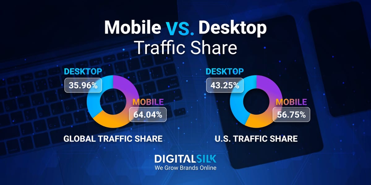
3. Mobile vs Desktop Performance Considerations
While many of the image‑performance principles apply universally, mobile has particular constraints and challenges—and often larger potential gains.
3.1 Why mobile is more sensitive to image size
Mobile users and devices face additional performance constraints:
-
Network connections are often slower (e.g., 4G, 3G, variable signals) compared to desktop (often broadband/WiFi). For instance, one dataset found a page load of 7.6 s on broadband (10 Mb/s) versus 13.9 s on slow 4G (1.5 Mb/s). Uploadcare
-
Mobile devices often have less powerful CPUs/GPU, so decoding/processing large images can take longer.
-
Data‑caps and limited bandwidth cost matter more on mobile; users may abandon pages that consume too much data. picreduce.com
-
The “mobile first” indexing means that mobile site performance is not optional—Google predominantly uses the mobile version for indexing/ranking. Upward Engine
To give a concrete example: while desktop might tolerate a somewhat slower load time, mobile users are less patient. One analysis: only ~64.9% of mobile sites achieved “good” INP scores, while ~96.8% of desktop did. Upward Engine
3.2 Desktop still matters but with different expectations
While mobile is critical, desktop performance should not be ignored:
-
Some users (especially in business, research, or high‑conversion contexts) are on desktops/laptops. Neglecting desktop can lose conversions and harm loyalty.
-
The technical resources on desktop are stronger (better CPU, faster network), so you may get away with slightly larger images—but still you should optimise because any delay impacts user satisfaction and SEO equally.
-
Differences in screen size mean images may need different dimensions and resolution for desktop; but you still don’t want to serve unnecessarily huge files (e.g., 5000 px wide hero images if the viewport is 1920 px).
3.3 Strategies for mobile vs desktop image optimisation
Responsive/Adaptive Images
Use <img srcset> with multiple image sizes: for example, smaller image for mobile (e.g., 600‑px wide) and larger for desktop (e.g., 1200‑px wide). One guide recommends:
-
Hero images: 1600‑2000 px wide for desktop, 750 px wide for mobile
-
Content images: 800‑1200 px (desktop), 600 px (mobile) PEAKONTECH
This ensures you don’t serve a huge desktop‑oriented image to a mobile device.
Format & Compression Choices
For mobile especially, choose formats and compression levels carefully. Since mobile devices may have less processing power and slower networks, aggressively optimised formats (WebP/AVIF) and moderate resolutions may help. Modern‑format research: WebP/AVIF can cut load time by ~15‑21% compared to JPEG. arXiv
Lazy Loading & Prioritisation
On mobile, prioritize above‑the‑fold images (the ones visible on screen first) and lazy‑load below‑the‑fold images. Since mobile users often scroll less deeply, this reduces initial payload. Image Scaler
Testing & Metrics by Device
Use device‑specific testing: simulate slower networks, mid‑/low‑end mobile CPUs. As one reddit post noted:
“On mobile, it simulates a slower phone (like a mid‑range Android) with limited CPU and a slow 4G network… your desktop score is great. Mobile 78 is still decent — it just means there’s some room to optimise for low‑end devices.” Reddit
Bandwidth & Data‑Cost Awareness
Users on mobile may have limited data plans or intermittent connections. Smaller image files reduce data cost and make your site more accessible in regions or contexts with constrained connectivity (especially relevant globally, including Nigeria). Minimising image size improves accessibility. picreduce.com
3.4 Real‑world numbers: Mobile vs Desktop
-
Research: Among ~500 websites, image weight for desktop ~1.40 MB and for mobile ~0.74 MB; yet load time varied significantly (desktop 7.6 s versus mobile 13.9 s). Uploadcare
-
Responsive‑images testing: Implementing proper responsive images led to “File size reduction: 40‑60% smaller images for mobile users” and “Load time improvement: 2‑4 seconds faster initial page loads.” hemaks.org
-
Because mobile performance lags, a small improvement (like optimising images) can yield relatively large performance gains and thus big user‑experience/engagement improvements.
4. Summary & Best Practice Checklist
4.1 Key takeaways
-
Images are a major part of webpage weight and thus a critical lever for performance.
-
Large/unoptimized image files slow down page load, degrade user experience (perceived and actual), and increase bounce rates.
-
Poor image performance harms SEO—via slower load, higher bounce, and negative Core Web Vitals metrics.
-
Mobile devices and users are disproportionately affected by large images—slower networks, weaker CPUs, data constraints—so optimisation is essential.
-
Desktop still matters, but you often have slightly more leeway; yet good practice is universal: serve appropriate sizes, compress, use responsive markup.
4.2 Image‑Performance Best Practice Checklist
-
Determine the display dimensions for each image on your site (hero, content, thumbnail) and avoid uploading larger than needed.
-
Use modern image formats (WebP, AVIF) with fallback support for browsers that don’t yet support them.
-
Compress images appropriately (lossy where acceptable; lossless where required).
-
Implement responsive images via
srcsetandsizesso each device downloads the most appropriate version. -
Set width and height attributes (or CSS) on images to avoid layout shifts (improve CLS).
-
Lazy‑load images that appear below the fold so they don’t delay the initial render.
-
Use a CDN and caching strategy to serve images quickly from geographic proximity.
-
On mobile especially: prioritise small file size, test under slower‑network conditions, keep data cost and CPU decoding in mind.
-
Monitor performance metrics (LCP, CLS, INP/FID) and business metrics (bounce rate, conversion, time on site) to track improvement.
-
Set performance budgets: e.g., aim for each image to be under ~200‑300 KB, or total image payload under a certain size threshold.
-
Keep analytics on bounce/engagement: link improvements in image performance with better user behaviour and conversions.
Core Techniques for Image Optimization
Image optimization is a critical aspect of modern web development, affecting not just site speed but also user experience, SEO rankings, and even conversion rates. With media-rich content increasingly dominating websites, optimizing images is no longer optional—it’s essential.
Whether you’re running an e-commerce site, a blog, or a corporate landing page, image optimization can significantly reduce page load times and bandwidth usage. This article dives into five core techniques for image optimization:
-
Resizing images properly
-
Choosing the right file format
-
Using compression tools and settings
-
Removing unnecessary metadata
-
Implementing lazy loading
1. Resizing Images Properly
One of the most basic yet most impactful steps in image optimization is resizing images to appropriate dimensions. Uploading large images and scaling them down using HTML or CSS wastes bandwidth and slows down load times.
Why Resizing Matters
Images directly affect your page’s loading speed. If your website displays a 300x300px image but loads a 3000x3000px version, it forces users to download ten times more data than necessary. This increases page weight and affects performance, particularly on mobile and low-bandwidth connections.
Best Practices for Resizing
-
Match display dimensions: Ensure the image you upload closely matches its rendered size on the page.
-
Use responsive image techniques: HTML5 provides tools like the
<picture>element andsrcsetattribute to serve different image sizes based on device resolution and screen size. -
Automate resizing: Use CMS plugins or image-processing libraries (e.g., Sharp, ImageMagick) to automate resizing on upload.
Tools to Resize Images
-
Online: TinyPNG, ImageResizer, PicResize
-
Desktop: Photoshop, GIMP, IrfanView
-
Code-based: Python (Pillow), JavaScript (Sharp)
2. Choosing the Right File Format
Each image format has its strengths and weaknesses. Choosing the correct format based on use-case ensures an optimal balance between quality and file size.
Common Image Formats
| Format | Best For | Pros | Cons |
|---|---|---|---|
| JPEG | Photographs | High compression, wide support | Lossy, artifacts may appear |
| PNG | Transparent images, logos | Lossless, supports transparency | Larger file sizes |
| GIF | Simple animations | Widely supported | Limited to 256 colors |
| WebP | Modern web usage | Small file sizes, transparency, animation support | Browser support (good, but still not universal) |
| AVIF | Cutting-edge optimization | Better compression than WebP | Limited support, slower encoding |
Format Selection Guidelines
-
Use JPEG for complex photos and gradients.
-
Use PNG for images that require transparency or sharp edges (like logos or icons).
-
Use WebP or AVIF for modern browsers to get smaller file sizes without sacrificing quality.
-
Avoid GIF for large animations; use MP4 or WebM instead.
Responsive Formats
You can serve modern formats like WebP conditionally by using the <picture> tag:
3. Compression Tools and Settings
Even after resizing and choosing the right format, images can still be large due to metadata, color depth, or inefficient compression. That’s where image compression comes in.
Lossless vs. Lossy Compression
-
Lossless: Preserves all image data. File sizes are larger but quality remains intact. Suitable for PNGs or source files.
-
Lossy: Reduces file size by discarding some image data. The loss is usually imperceptible at moderate compression levels. Ideal for JPEGs and WebPs.
Compression Tools
Online Tools
-
TinyPNG / TinyJPG: Smart lossy compression for PNG and JPEG.
-
Squoosh.app: Google’s tool supporting multiple formats and advanced settings.
-
Kraken.io: Bulk compression with lossless and lossy options.
Desktop Software
-
ImageOptim (Mac): Drag-and-drop interface, great for batch compression.
-
RIOT (Windows): Customizable output settings.
-
GIMP: Open-source image editor with built-in compression controls.
Command-line Tools
-
jpegoptim and optipng: Fine-tune compression settings.
-
mozjpeg: Offers better compression ratios for JPEGs.
-
cwebp and avifenc: Convert images to WebP or AVIF with adjustable quality settings.
Best Practices for Compression
-
Use progressive JPEGs for faster loading.
-
Test different compression levels to find the balance between quality and size.
-
Automate compression using CI pipelines or CMS plugins.
4. Removing Metadata
Image files often contain extra data such as GPS coordinates, camera information, copyright tags, and editing history. While useful for photographers, this metadata adds unnecessary weight to images on the web.
Why Remove Metadata?
-
Reduces file size: Metadata can add several kilobytes to each image.
-
Protects privacy: Strips out potentially sensitive information (e.g., GPS location).
-
Improves load time: Especially important for high-volume sites.
Tools to Remove Metadata
-
ImageOptim: Removes EXIF and other metadata automatically.
-
ExifTool: Advanced command-line tool to view and strip metadata.
-
Photoshop/GIMP: Use “Save for Web” or export options to exclude metadata.
-
This command removes all metadata from the file
image.jpg.
CMS & Plugin Support
Many CMS platforms like WordPress offer plugins (e.g., ShortPixel, Smush) that remove metadata on upload automatically.
5. Lazy Loading
Lazy loading is a performance technique that delays the loading of images until they are actually needed—usually when they enter the user’s viewport. This reduces initial page load time and saves bandwidth.
How Lazy Loading Works
Instead of loading all images when the page loads, images below the fold are loaded only when the user scrolls down. This allows the browser to prioritize visible content first.
Implementing Lazy Loading
Native HTML Support
Modern browsers support lazy loading with a simple attribute:
JavaScript Libraries
For older browser support or more advanced use cases:
-
lazysizes.js: Lightweight and flexible.
-
Lozad.js: Minimal dependency, Intersection Observer-based.
CMS Plugins
-
WordPress: Lazy loading is native as of version 5.5, but plugins like WP Rocket or Smush offer more control.
-
Shopify, Wix, Squarespace: May require built-in settings or apps for lazy loading.
Best Practices
-
Combine lazy loading with responsive images for best results.
-
Don’t lazy-load above-the-fold images to avoid perceived delays.
-
Monitor performance with tools like Lighthouse or WebPageTest.
Manual vs. Automated Optimization Workflows
In today’s digital landscape, optimization workflows play a critical role in improving website performance, enhancing user experience, and reducing resource consumption. Optimization encompasses a broad range of tasks—from compressing images to minifying code, optimizing fonts, and more. As websites and applications grow increasingly complex, developers and designers face the choice between manual and automated optimization workflows. Each approach has its strengths and weaknesses, and understanding when to use one over the other is essential for efficient, effective development.
This essay explores the nuances of manual and automated optimization workflows, discusses when manual optimization is still relevant, delves into automation within Content Management Systems (CMSs) and build pipelines, and examines some commonly used tools such as ImageMagick, Gulp, and Webpack plugins.
1. Understanding Optimization Workflows
Optimization workflows are sequences of processes aimed at improving the performance and efficiency of digital assets. In web development, optimization often focuses on reducing file sizes, improving load times, and ensuring assets are delivered in a way that balances quality and speed.
Manual Optimization
Manual optimization involves human intervention at each step. Developers or designers select assets, tweak parameters, and use specialized software or commands to optimize files individually. This process is hands-on, requiring detailed knowledge of the tools and the desired outcome.
Automated Optimization
Automated optimization uses scripts, plugins, or software that can optimize assets systematically and without direct human intervention on each file or task. Automation can be integrated into build pipelines or content management systems, allowing optimization to happen seamlessly during development or deployment.
2. When to Optimize Manually
Despite the advances in automation, manual optimization remains important in certain contexts. Here are some scenarios where manual optimization is preferable:
2.1 Precision and Customization
Manual optimization allows fine control over every parameter. For example, when optimizing images for a high-end photography website, a designer may want to tweak compression levels carefully to retain maximum image quality without unnecessary file size bloat. Automated tools might apply general compression levels that degrade image quality beyond acceptable levels.
2.2 Small Scale or One-Off Tasks
For small projects, one-time optimizations, or quick fixes, manual optimization is often faster. When only a handful of images or files need optimization, manually adjusting and exporting them can be more efficient than setting up automation pipelines.
2.3 Unique or Complex Assets
Some assets, like custom fonts, SVGs with complex animations, or specialized graphics, may require manual editing or optimization techniques that automated tools cannot handle appropriately.
2.4 Debugging and Troubleshooting
When automated workflows produce unexpected results, manual optimization helps isolate problems. Developers can manually optimize an asset and compare outputs to diagnose issues.
2.5 Learning and Understanding
For developers new to optimization, manual workflows provide educational value, helping them understand the impact of various optimization settings and techniques before trusting automation to handle everything.
3. Automation in CMSs and Build Pipelines
Automation in web development has become mainstream due to the growing complexity of projects, the need for consistency, and efficiency. Two main environments where optimization automation thrives are Content Management Systems (CMSs) and build pipelines.
3.1 Automation in Content Management Systems (CMSs)
Modern CMSs like WordPress, Drupal, and Joomla often provide built-in or plugin-based optimization tools. These tools automatically optimize images upon upload, minify CSS and JavaScript, and cache content to enhance site speed.
-
Image optimization plugins: Tools like WP Smush, EWWW Image Optimizer, or ShortPixel automatically compress and resize images uploaded through the CMS admin panel.
-
Cache and minify plugins: Plugins such as Autoptimize and W3 Total Cache minify CSS/JS files and handle caching to reduce load times.
CMS-based automation simplifies maintenance and ensures that content creators without technical expertise still benefit from optimized assets.
3.2 Automation in Build Pipelines
Build pipelines are automated workflows executed during the development lifecycle, typically during the build or deployment phase. Tools like Gulp, Webpack, and others help automate optimization tasks as part of continuous integration and deployment (CI/CD) processes.
-
Image optimization: Integrating image compression tools directly into the build process means that every time an image is added or modified, it gets optimized automatically.
-
Minification and bundling: JavaScript and CSS files can be minified and bundled, reducing the number of HTTP requests and file sizes.
-
Cache busting: Automated generation of unique file names for updated assets ensures browsers load the latest files instead of cached versions.
Automation within build pipelines enhances developer productivity, maintains consistency across environments, and speeds up deployment times.
4. Example Tools for Optimization
Various tools support both manual and automated workflows, helping developers and content managers optimize digital assets efficiently.
4.1 ImageMagick
ImageMagick is a powerful, open-source command-line tool for image manipulation. It supports hundreds of image formats and offers advanced options for resizing, compressing, converting, and transforming images.
-
Manual use: Designers can manually run commands to optimize individual images, for example:
-
Automation use: ImageMagick commands can be scripted and integrated into build processes for batch image optimization.
ImageMagick is especially useful for complex image processing tasks that require precision and customization.
4.2 Gulp
Gulp is a JavaScript task runner used to automate repetitive tasks such as minifying CSS/JS files, optimizing images, and compiling preprocessors like Sass.
-
Automated workflows: Gulp enables creating a pipeline of tasks where files pass through various plugins automatically.
-
Example: Using gulp-imagemin to optimize images during build:
Gulp’s flexibility and plugin ecosystem make it a popular choice for integrating optimization into build workflows.
4.3 Webpack Plugins
Webpack is a powerful module bundler for JavaScript applications, widely used in modern frontend development. It offers plugins that facilitate automated optimization.
-
Image optimization: Plugins like
image-webpack-loaderoptimize images during the bundling process. -
Minification: Webpack uses
TerserPluginor similar to minify JavaScript automatically. -
Example Webpack config snippet:
5. Benefits and Drawbacks of Manual vs. Automated Optimization
5.1 Manual Optimization
Benefits:
-
Precise control over output.
-
Ability to tailor optimization per asset.
-
Better for unique or complex assets.
-
Educational and debugging value.
Drawbacks:
-
Time-consuming and labor-intensive.
-
Prone to human error.
-
Difficult to maintain at scale.
-
Inconsistent results if done by different people.
5.2 Automated Optimization
Benefits:
-
Saves time and reduces repetitive work.
-
Ensures consistency across assets.
-
Easily integrates into CI/CD pipelines.
-
Scalable for large projects.
Drawbacks:
-
May apply suboptimal or generic settings.
-
Requires setup and configuration.
-
Can obscure optimization logic, making debugging harder.
-
Risk of over-optimization or quality loss if not properly configured.
6. Choosing the Right Approach
Deciding between manual and automated optimization depends on project scale, team expertise, asset types, and performance goals.
-
For small projects or when quality control is paramount, manual optimization is ideal.
-
For medium to large projects with many assets and frequent updates, automation is critical for efficiency.
-
Hybrid approaches often work best, combining automated baseline optimization with manual fine-tuning of key assets.
Key Tools and Software for Image Optimization
In the digital age, image optimization is crucial for enhancing website performance, improving user experience, and boosting SEO rankings. Optimized images load faster, reduce bandwidth usage, and ensure visuals retain quality without compromising page speed. Whether you’re a web developer, graphic designer, marketer, or content creator, having the right tools for image optimization can make a significant difference.
This comprehensive guide explores the most effective and widely used tools and software for image optimization, divided into four categories:
-
Desktop tools
-
Online compressors
-
Command-line interface (CLI) tools
-
Content Management System (CMS) plugins
Desktop Tools for Image Optimization
Desktop tools offer a versatile and powerful approach to image editing and optimization. They provide granular control over image quality, dimensions, formats, and compression settings. These tools are often preferred by professionals who require high-quality outputs with precise control.
1. Adobe Photoshop
Overview: Adobe Photoshop is the industry-standard graphic editor, used by professionals worldwide for image creation, manipulation, and optimization. Though primarily a raster graphics editor, it offers robust image optimization features.
Image Optimization Features:
-
Save for Web (Legacy): This feature allows users to fine-tune compression, choose file formats (JPEG, PNG, GIF), and preview quality vs. file size trade-offs.
-
Export As: A modern alternative with drag-and-drop resizing, format conversion, and quality adjustments.
-
Batch Processing: Automate optimization across multiple images using actions and scripts.
-
Color Profile Management: Embed or strip color profiles to reduce file size.
Use Case: Ideal for designers who need to optimize images during the editing process and want granular control over quality and file size.
2. GIMP (GNU Image Manipulation Program)
Overview: GIMP is a free, open-source alternative to Photoshop. It provides many advanced image editing features, including robust optimization tools.
Image Optimization Features:
-
Export Options: Allows exporting in various formats with adjustable compression settings (e.g., JPEG quality, PNG compression).
-
Batch Processing: Using plugins like BIMP (Batch Image Manipulation Plugin), users can automate repetitive optimization tasks.
-
Color Depth Reduction: Reduce image bit depth to shrink file sizes.
-
Open-source flexibility: Users can customize or script optimization workflows.
Use Case: Suitable for users seeking a free yet powerful desktop tool for image optimization without investing in paid software.
3. Affinity Photo
Overview: Affinity Photo is a professional-grade image editor that provides many of Photoshop’s features at a lower cost, often praised for its speed and performance.
Image Optimization Features:
-
Export Persona: Offers multiple export presets for optimized image sizes and formats.
-
Batch Export: Optimize many images with customized compression and scaling.
-
RAW Image Processing: Optimize raw files directly to reduce file size without sacrificing detail.
-
Multiple Format Support: Export images in JPEG, PNG, GIF, TIFF, and WebP with adjustable compression.
Use Case: Ideal for professionals who want a powerful, cost-effective Photoshop alternative with excellent image optimization options.
Online Compressors for Image Optimization
Online compressors offer quick, easy, and accessible solutions for image optimization without installing software. They are perfect for casual users, marketers, and small teams needing fast compression.
1. TinyPNG / TinyJPG
Overview: TinyPNG is a popular web-based tool specializing in compressing PNG and JPEG files using smart lossy compression techniques.
Key Features:
-
Drag-and-Drop Interface: Simple and user-friendly.
-
Batch Uploads: Optimize multiple images at once.
-
API Access: Integrate compression into websites or apps programmatically.
-
Preserves Transparency: For PNG images.
-
File Size Reduction: Typically reduces PNG files by 50-80% and JPEGs by 20-40% with minimal quality loss.
Use Case: Ideal for bloggers, small businesses, and website owners needing fast, hassle-free image optimization.
2. Squoosh
Overview: Developed by Google Chrome Labs, Squoosh is an open-source online image compressor that supports multiple formats and offers detailed control over compression settings.
Key Features:
-
Wide Format Support: JPEG, PNG, WebP, AVIF, MozJPEG, and more.
-
Visual Comparison Slider: See before-and-after images in real-time.
-
Advanced Options: Adjust quality, resize, change color profiles, and more.
-
Offline Use: Runs directly in the browser without uploading images to the server.
-
Open Source: Transparent and free.
Use Case: Perfect for developers and designers wanting detailed control over compression parameters in an easy-to-use browser tool.
3. Kraken.io
Overview: Kraken.io is an online image optimization platform offering both a web interface and API for developers.
Key Features:
-
Lossy and Lossless Compression: Choose depending on quality or file size priorities.
-
Batch Optimization: Upload and optimize large batches of images.
-
Cloud Storage Integration: Connect to Dropbox, Google Drive, or Amazon S3.
-
Image Resizing: Resize images during compression.
-
API: Automate image optimization in workflows.
Use Case: Suitable for businesses and developers needing scalable, automated image optimization solutions with cloud integration.
Command-Line Interface (CLI) Tools for Image Optimization
CLI tools provide powerful, scriptable, and automated image optimization capabilities. They are often favored by developers and system administrators who want to integrate optimization into build processes or deployment pipelines.
1. ImageMagick
Overview: ImageMagick is a versatile open-source software suite for image manipulation via the command line.
Key Features:
-
Format Conversion: Convert images between hundreds of formats.
-
Resizing and Cropping: Batch resize images with precise control.
-
Compression: Apply compression parameters to JPEG, PNG, GIF, and other formats.
-
Automation: Integrate into scripts for bulk image optimization.
-
Advanced Filters: Apply color adjustments, sharpening, and more.
Example Command:
Use Case: Perfect for developers who need customizable, automated image processing and optimization in server environments.
2. jpegoptim
Overview: jpegoptim is a specialized CLI tool focusing on optimizing JPEG files by adjusting compression and stripping metadata.
Key Features:
-
Lossy and Lossless Optimization: Choose compression level or lossless size reduction.
-
Metadata Removal: Strip unnecessary EXIF or comment data to reduce size.
-
Progressive JPEG Support: Create progressive JPEGs that load incrementally.
-
Batch Processing: Optimize many images efficiently.
Example Command:
Use Case: Ideal for developers or sysadmins optimizing JPEG-heavy image libraries with focus on reducing file size and improving load speed.
3. mozjpeg
Overview: MozJPEG is an enhanced JPEG encoder developed by Mozilla aiming to improve compression efficiency while preserving visual quality.
Key Features:
-
Improved Compression: Better file size reduction compared to standard JPEG encoders.
-
Progressive JPEGs: Creates progressive images for better user experience.
-
Tuning Parameters: Customize compression speed and quality.
-
Open Source: Free and widely supported.
Example Command:
Use Case: Suited for developers looking to maximize JPEG compression efficiency without compromising quality.
CMS Plugins for Image Optimization
Content Management Systems (CMS) like WordPress, Shopify, and others offer plugins that automate image optimization as part of the publishing workflow, making them essential for website owners who want seamless integration.
1. WordPress Plugins
WordPress powers over 40% of websites worldwide, making image optimization plugins essential for performance.
a. Smush
Features:
-
Automatic Compression: Optimizes images on upload.
-
Bulk Optimization: Compress existing images in the media library.
-
Lazy Loading: Defers loading of images until needed.
-
WebP Conversion: Supports next-gen image formats.
-
No File Size Limit: Compresses images of any size.
Use Case: Ideal for bloggers and site owners seeking automated, hands-off image optimization.
b. ShortPixel
Features:
-
Lossy and Lossless Compression: Choose your balance of quality vs. size.
-
WebP and AVIF Support: Convert images to modern formats.
-
Bulk Optimizer: Compress thousands of images.
-
Backup Originals: Retain original files for recovery.
Use Case: Great for professional websites needing advanced compression with support for new formats.
2. Shopify Apps
Shopify merchants rely heavily on visuals to showcase products. Optimization apps improve site speed and conversions.
a. Crush Pics
Features:
-
Automatic Image Compression: Optimizes images during upload.
-
Resize Images: Control maximum image dimensions.
-
Bulk Compression: Process existing images.
-
Supports JPEG and PNG.
Use Case: Best for Shopify store owners wanting easy image optimization without technical setup.
b. Image Optimizer by SpurIT
Features:
-
Lossless and Lossy Compression Options.
-
Image Resizing: Control dimensions for faster loading.
-
Bulk Optimization: Quickly optimize product images.
-
Real-time Compression Stats: Monitor image size reduction.
Use Case: Useful for stores with large catalogs aiming to maintain image quality while reducing load times.